
A masterclass in using IKEA cabinetry to make a kitchen more efficient
The kitchen is meant to be the heart of the home, but for Jennifer from Centennial, CO, her original kitchen felt anything like it. That is of course, until her family decided to remodel the space using IKEA cabinets and IKD’s design services.
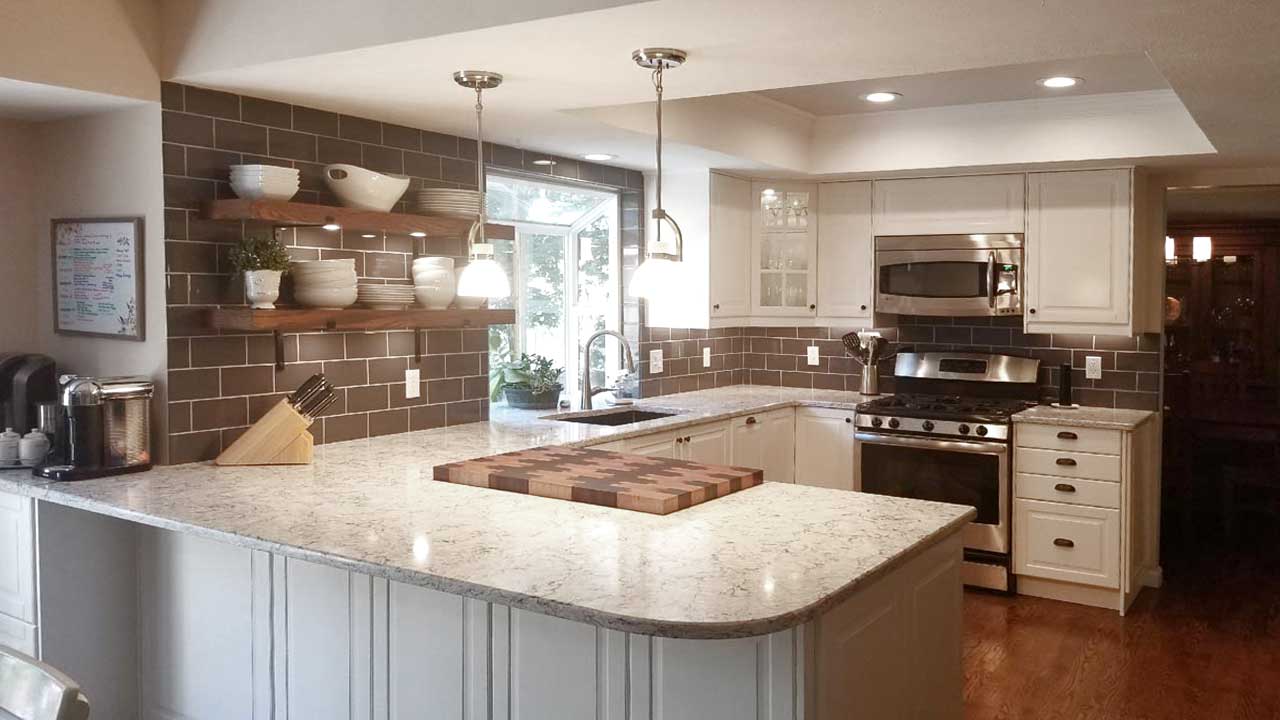
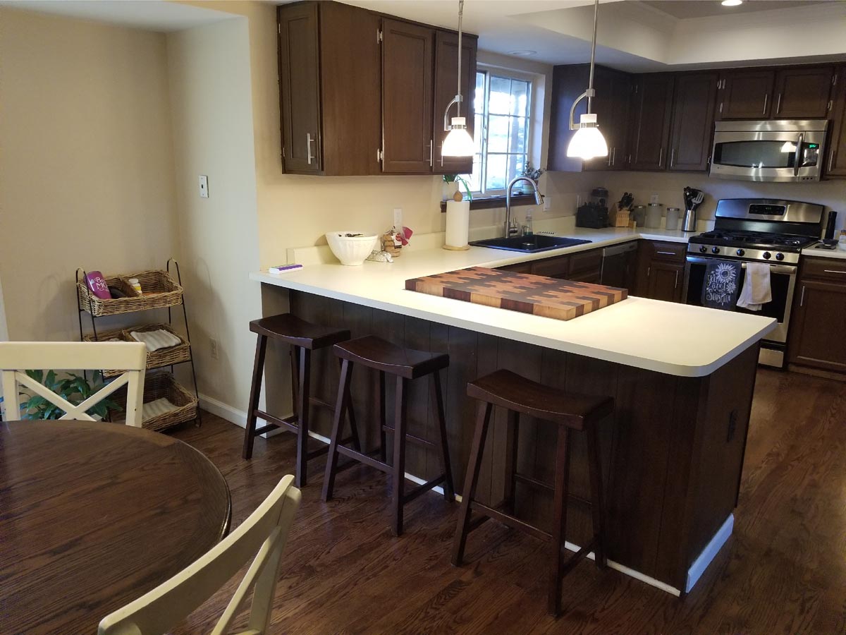
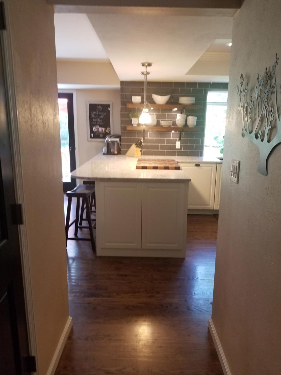
“We needed our new space to function better. Our original kitchen was inefficient and it just never felt right,” she explains. “Plus, with the view walking into the kitchen area from the front hallway, you looked straight at the end of the peninsula. It was an eyesore.” This meant incorporating multiple design revisions– all based around IKEA BODBYN cabinet doors in off-white with IKEA SEKTION framework.
And there were many challenges inherent with the original layout. For example, the floor plan featured wood floors in the kitchen that weren’t finished under the cabinets, so Jennifer didn’t want to redo the floors. “The design needed to at least cover the same footprint,” she explains. Also in its original configuration, there wasn’t even adequate space for a trash can in the kitchen!
By incorporating floating shelving and other creative storage ideas from IKEA, the space took on a whole new life, she says. “Before, it was dark and boring with Formica counters. The kitchen now looks modern and fresh! It reflects the decor in the rest of the house and is now the heart of our home,” she says. Let’s see how the IKD design team accomplished this transformation.
Why Design
with IKD?
Why Design with IKD?
Design desires
With a busy family who entertain often, presentation was a key for this kitchen – and that meant ample storage in multiple ways.
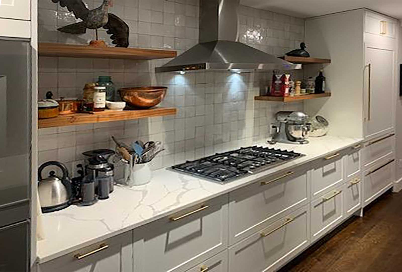
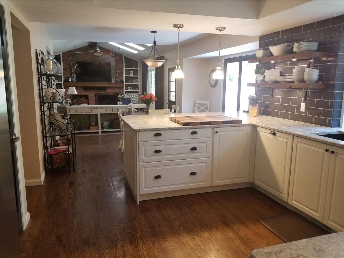
For instance, Jennifer wanted to feature a pre-es- tablished baker’s rack, shelving and one sentimental item – a cutting board, which blends with the warm tones of the shelving. “We wanted the kitchen to look totally open; like IKEA’s Scandinavian styling” she says. “We also wanted one of those hidden drawers in the second drawer for spices.”
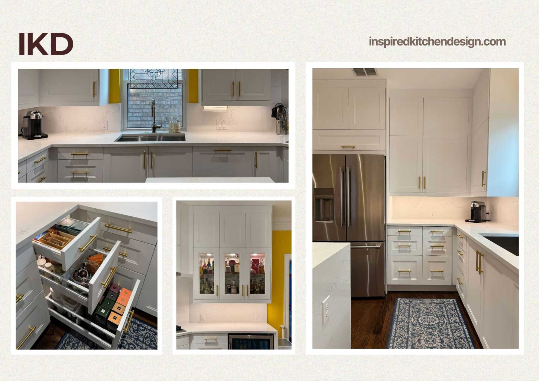
To create the airy design theme they desired – and to accommodate the necessary storage options – the family chose IKEA BODBYN cabinet doors in gray and paired them with BODBYN off-white cabinetry throughout with IKEA SEKTION framework, including the revised pantry area and coffee station.
“We picked IKEA’s cabinets because we heard they’re sturdy and the biggest bang for the buck,” Jennifer explains. “We had a small budget ($25,000) so they were the way we could get what we wanted in our price point.” The cabinetry was complemented by black ENERYDA cabinet knobs and cup handles from IKEA. She selected Silestone quartz for the countertops, bought from YK Stone Center in Denver, CO.
Design challenges
The original kitchen presented several challenges. Since the flooring was an issue the family didn’t want to move any large appliances. “Before our appliances were shoved into cabinets, in the garage, in the basement and on the countertop. Now there is more than enough room for everything!” she says.
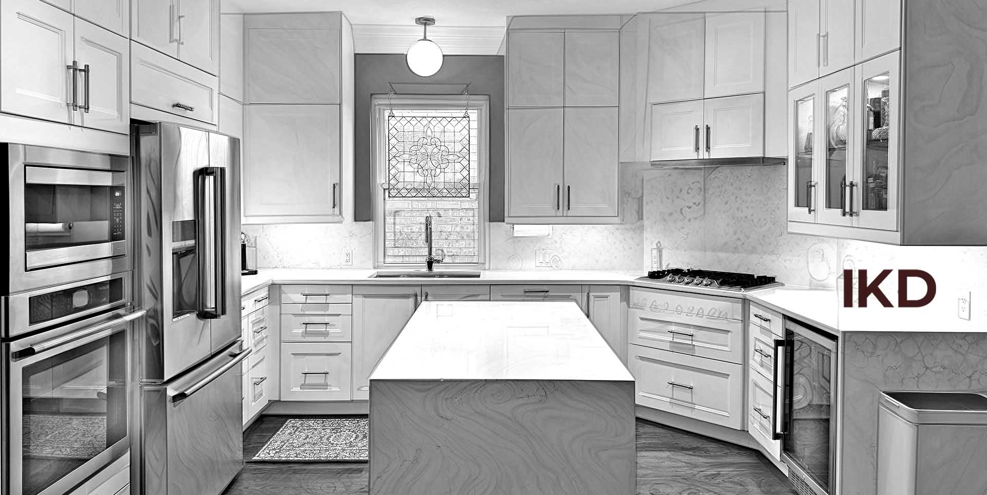
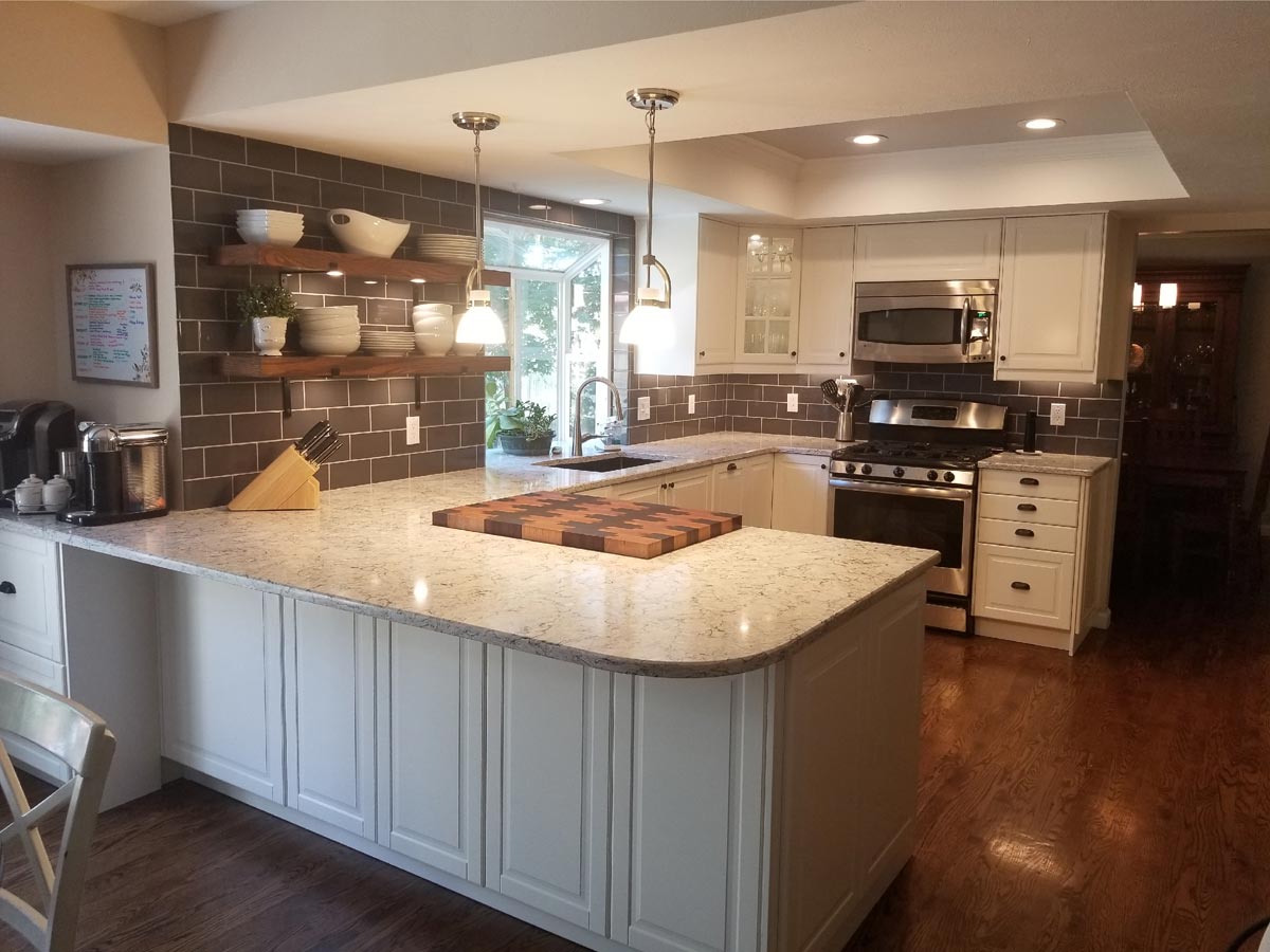
The peninsula, which was considered an “eyesore,” is now a centerpiece of the space, including faux doors for added appeal and multiple storage options.
The IKD team also took underused space from the previous layout, extended the back of the peninsula and was able to create a personal coffee station, including storage with additional IKEA BODBYN drawers.
Design solutions
Jennifer knew she needed design experts to navigate the design process. “We did some research and found that people’s biggest complaint was IKEA’s kitchen design software. We wanted to get someone who knew the IKEA system and how to make things work in ways we had not thought of – that was IKD,” she says. In fact, IKD turned what was one ofthe original challenges of the kitchen into a highlight – literally.
“The main window over the sink was old and falling apart. Although it offered a great view of the backyard, we wanted more natural light. So we asked IKD to bring the frame down to counter level and replace the window,” she says.
“This window is one of our favorite parts of the remodel – it totally opened up the kitchen.”Since the design called for chang-ing the location of dish storage, the dishwasher was moved to the other side of the sink for efficiency sake. With the space originally occupied by the dishwasher now available, a concealed IKEA pullout trash can was installed.
Likewise, items like glasses and dishes found new homes, such as a glass front corner piece that displays glassware, and open shelving over the peninsula wall which houses plates and bowls. “The dishes are right there, easy to grab and put away, and the white dishes on the dark tile really make a statement!” she adds.
Lastly, a space that originally housed the refrigerator and a pantry area was flipped. The refrigerator was moved to the right and more BODBYN storage drawers were added to the left. “The kitchen just flows so much easier and the kids have easy access to what they need,” she describes.
She adds: “My advice is think about how you want your kitchen to function. Inventory your kitchen items and envision how they will be used and where you want them stored.” IKD also recommended installer B. Young Renovations based in Aurora, CO.
She concludes: “Our installer was wonderful. He had it all ripped out and installed in seven days. If we’d tried to do it ourselves we would have lost our minds!”
Get a Professional IKEA Kitchen Design – All Online
Work with our certified kitchen designers to get a personalized kitchen designed around your needs and vision. If you’re interested in learning more about our service, make sure to check out our IKEA Kitchen Design Services.
See more IKD designed IKEA kitchens. Also learn more about our IKEA kitchen design services and where to find IKEA kitchen installers.


